Final Blog
After
completion of all of the modules for this course, I realized that the modules
are designed to support one main concept and that is to harness the proliferation
of data in this Big Data era, to generate knowledge and to create value for organizations.
Business Intelligence tools can be applied to different industries and domains
to provide actionable insights and lead to better decision making. Examples of
this can be for the medical field to understand the spread of cancer, forecasting
trading opportunities for stocks, or to better enhance content on an e-commerce
platform to retain the customer base. The types
of information that one can derive from different sources of data are endless and organizations can tailor their data analysis based on questions they would
like to find answers to. In order for a business to gain a competitive
advantage in the industry, it must leverage Business Intelligence to gather and
analyze the data to set up goals that align with the business initiatives. Then,
the business should implement and monitor the metrics to ensure that the
performance is in line with the target. Lastly, since industry rivals are
always playing catch up, the business must continue to innovate to create a new value
proposition for its customers in order to remain a differentiator in the market
and gain a period of competitive advantage.
Introduction
to Big Data
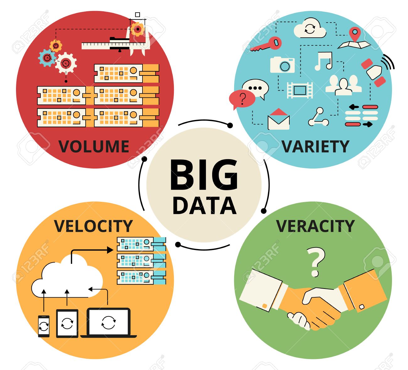
During the first week of class, we were introduced to Big Data and how "Big"
represents the high variety, large volume, and high speed of the data that are
being ingested through all different types of sources such as IoT devices,
social media content, our digital footprints, and
many others as we live in a world of datafication. According to IBM, there is also
a fourth V to Big Data and that is veracity or the quality and accuracy of the
data. Veracity discussed the importance of collecting accurate metrics that
really matter and recommended using native APIs when possible. Although
veracity is not explicitly discussed in this course, I believe it is always
important to assess the quality of data to avoid duplicates or unmeaningful
data, which supports the Data Quality Analysis lecture of this course. With Big
Data where the data population is N = ALL, it opens the doors of opportunities
for different fields to make sense of all the data that's available and to use BI
tools to convert data into knowledge and to wisdom, which allows the organization to continue to
improve.
Data
Warehouse
After the
introduction to Big Data, the data warehouse, and its design cycle was discussed to
understand the difference between OLTP, Online Transaction Processing, and OLAP
or Online Analytical Processing. The difference between the two is that OLTP is
usually for databases to perform lots of reads, writes, and updates like a salesperson inputting an order for example. OLAP, on the other hand, contains data across
a period of time and is used to support management decision making. Data
warehouses are of interest to us since it is a significant tool for business
intelligence. An example of OLAP would be an online store trying to understand which
product generated the most revenue over the course of 6 months. There are two
types of dimensional modeling to design data warehouses, star schema, and
snowflake schema. The snowflake schema differs from a star schema where it
normalizes the dimension tables. Nevertheless, a business should decide between
the two models based on their business needs, nature of the business, cost and time
that they are willing to invest in, and also the levels of dependencies between
functions.

The first assignment
to design a data warehouse was very challenging for me because I was not able
to physically interact with the information on an actual database. I also found
it hard to come up with categories of questions that can be answered using the
data warehouse. Even though I have learned about degenerate dimension, role-playing dimension, and time dimension through the lectures, it was difficult
for me to understand how to manipulate the check-in time, check-out time and as
well as the procedure times. Aside from that, I followed the four-step process
to design the fact and dimension tables by selecting the business process
model, declaring the grain, choosing the dimensions and finally choosing the
facts. Upon completion of this assignment, I was able to better understand the
difference between facts and dimensions and how a time dimension can be shared
with multiple role-playing dimensions. I also learned that it is super important
to declare the different categories of questions ahead of time, since it will
serve as a basis for the design of the data warehouse.
Balanced
Scorecard
During the first module of this course, we also discussed Balanced Scorecards and how it is very
useful in linking organizational goals to the strategy that's needed to achieve
these goals. Balanced Scorecards assist in identifying metrics and KPIs to
measure how an organization is performing against its goals. Balanced Scorecard
focuses on four different perspectives of the organization including financial,
internal business processes, customer, and learning and growth. With a Balanced
Scorecard, a business can focus on applying strategies to all four perspectives
and set up goals to improve each of these perspectives such as excelling at
customer service for the customer perspective. The course also provided an
excellent example of how Southwest Airlines successful developed strategies
using the Balanced Scorecard and assigned objectives, measures, targets, and
initiatives to each of its perspectives. However, it is important to note that in order for a Balanced Scorecard to succeed, it should be kept as a living document and all departments should
understand and agree upon the vision from the Balanced Scorecard.

Designing Dashboards and Tableau
I found
the module regarding dashboards very interesting as it emphasized the
importance of less is more. I understood that just like any other business
intelligence tools that we have used previously in this course, a dashboard should
be designed to reveal a specific topic of interest for the end-user, at a
glance. Dashboards like Tableau is an excellent data visualization tool for businesses
to make important decisions without having to combine tons of excel files and
waiting for the IT team to generate a report. Dashboards should also not be
cluttered but should rather allow instant detection of any
abnormal values to allow further drill-downs.
Assignment
II. allowed me to again come up with my own questions and suggestions based on
the bird strikes data. After my previous experience with Assignment I., I
realized that I was able to derive questions regarding this data much easier
this time. When interacting with Tableau, which I have never previously
encountered, I felt that it was very user-friendly and I was able to directly
drag and release the different attributes to create instant visualizations without having to perform complex joins. I feel like it would also be easy for those without a technical background to conduct Tableau dashboards and use it to make key business decisions. I
also enjoyed identifying the answers to my questions such as when and where are
bird strikes typically happening. Previously, I did not know that
there were so many bird strikes occurring in the U.S. that caused a significant
cost to repair the airplanes.


Web
Metrics and Google Analytics
Week 5's material was my favorite module as we explored Web Analytics and Google
Analytics. Web Analytics allows businesses to better understand the visitors to
their websites by asking the questions of the Five W's. Other metrics for Web
Analytics includes the number of visitors, exit rate, bounce rate, conversion
rate, and task completion rate. There are also different types of web traffics
such as direct traffic, organic traffic, referral traffic, and campaign
traffic. A business can look into the different types of web traffic and their
corresponding web metrics such as conversion rate and bounce rate, to determine
if they would need to fix the landing page for a type of traffic or invest in
more money in traffics with a high conversion rate and low bounce rate.
While I
was experimenting with Google Analytics using the Google Merchandise Store for Assignment III., I was so
amazed that one could generate so many types of reports from GA such as the
audience report, behavior report, conversion report, and also custom reports. It
never occurred to me before this class that when I was exiting a site, it would
be recorded as a bounce rate on their platform. By using Google Analytics, a
company is now able to better identify their target users, what types of content they are interested in browsing, and when are these users most active. An
organization can set up its goals in Google Analytics and measure their
conversion rates and how they can continue to improve their sites as they began to tailor the site to fit the users' needs. An excellent example of an organization using GA
is an e-commerce website that is looking to identify the demographics of their visitors, the merchandise
that generates the highest revenue, and as well as which page has the highest exit
rate. If the page with the highest exit rate is the checkout page, the business
should look into ways to implement a more convenient and appealing checkout
page.


Network
Analysis
For the last module of this course, we discussed the network and how we can use network analysis
and network visualization to understand very complex systems and their behaviors. With network visualization, it allows fast detection of communities and how the members are interacting with each other in the network. It also assists in differentiating between two networks that otherwise have very similar network statistics such as in the case with Google vs Apple Patent Analysis. Network analysis and visualization can be used in almost any scenario that requires connections and interactions. Some topics to conduct a network analysis could be on Linkedin members and their relationships with one another, a disease that's highly contagious and spreading across communities, or it could be the crime in a neighborhood with critical members that are facilitating the crime. By using network visualization in combination with the different network properties such as betweenness centrality, density, and Eigenvector centrality, it allows the analyst to see the full picture and get a better understanding of the complex relationships between nodes and to act and plan accordingly to achieve the organization's goal.

The international trade data of 2017 represented an excellent source of data for network visualization and analysis using Gephi as international trade has always been an extremely complex phenomenon. Since I did not have any previous knowledge about international trade, I feel that this assignment really broadened my horizon and killed two birds with one stone. By visualizing the network of trade between countries, I identified different communities on Gephi and ranked the size of the nodes based on their betweenness centrality. The observations that I have made from Gephi aligned with my readings about international trade where countries in the same communities have a better trade relationship than those outside of their community. The countries with the highest centrality values demonstrated the greatest influence in international trade and had higher values of exports and imports compared to other countries. Since I have previously heard about Brexit, this assignment also provided a great opportunity for me to identify growing trade partners for the United Kingdom as they will no longer receive free trade with members of the EU after the divorce. I'm excited to see what's going to happen to the United Kingdom after Brexit and if my predictions are correct!
Final Thoughts
Overall, I really enjoyed this course! Although there were challenging assignments that required me to work with completely new BI tools for the first time, it also pushed me to pick up these skills and feel more confident in designing solutions for businesses. I also felt that I was able to think more critically by constantly brainstorming questions that businesses would like to seek answers to, and use Business Intelligence tools to answer these questions and make critical decisions. After finishing all the modules of this course, I realized that the course has taken me through many phases of the BI life cycle, including Visualization and Descriptive Analysis, Reporting and Dashboards, and Determining Questions. My final recommendation for organizations out there is that, why not take advantage of this massive amount of available data and apply Business Intelligence to innovate, improve performance, and become a differentiator in the market?
References
Foster,
Patrick. What Are the 4 Vs of Big Data & How to Apply Them?. Retrieved
from https://forwardleading.co.uk/blog/What-Are-the-4-Vs-of-Big-Data-How-to-Apply-Them.
Jackson, Ted. How To Use The Balanced Scorecard (& Know If Yours Is Failing). Retrieved from https://www.clearpointstrategy.com/how-to-use-balanced-scorecard/?fbclid=IwAR1kYhq2LS0sewTN-d8U0TsOVnnCRk7j_1f-GQK6qxTMFsbUeDvoQ6UdkX0.
McAfee, A., & Brynjolfsson, E. (2008). Investing in IT that makes a competitive difference. Harvard Business Review, 87(7/8), 98.
McAfee, A., & Brynjolfsson, E. (2008). Investing in IT that makes a competitive difference. Harvard Business Review, 87(7/8), 98.
Sansu, George. Inmon or Kimball: Which approach is
suitable for your data warehouse?. Retrieved from https://www.computerweekly.com/tip/Inmon-or-Kimball-Which-approach-is-suitable-for-your-data-warehouse?fbclid=IwAR3Nq8u4YeZE1oDRrUMbm6tL7d7CNMLx_A8LlaxlV8N3u4ggtnanFcUyB3Q.


You wrote a really great analysis for the final blog. I agree that after going through all of the modules, big data seems to be the common theme throughout the course. From data warehouses to the network analysis, everything regarding the study of business intelligence is tied to gaining strategic knowledge from harnessing data. Also, I hadn't realized that this course had taken us through the BI lifecycle. Everything came full circle during the last eight weeks.
ReplyDelete-Dazmin
Thank you for a great semester!
Delete